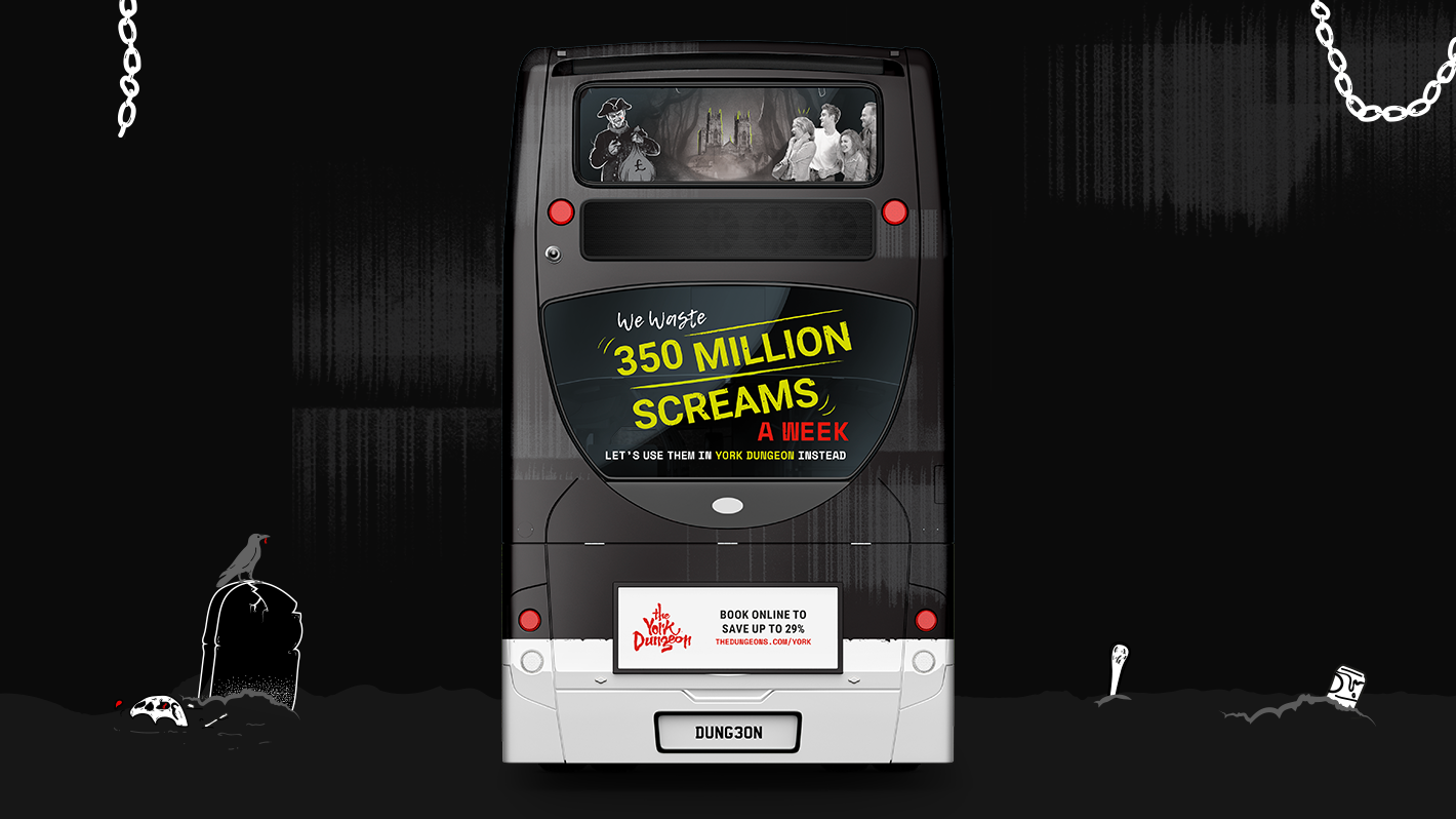
Brand identity designed for Waste Less South Yorkshire, a campaign to reduce waste and increase recycling in the region. Designed when employed by Moirae Creative.
Before doing any creative work we studied existing research into behaviours around recycling and waste, and together with the client created 4 user profiles which represented different recycling attitudes across the South Yorkshire demographic. This research led us to create an approachable and positive brand with an eclectic colour palette which could be adapted to different messaging strategies. The logo itself is a visual metaphor, by overlapping "Waste" and "Less" we have effectively recycled the letter "E"!
